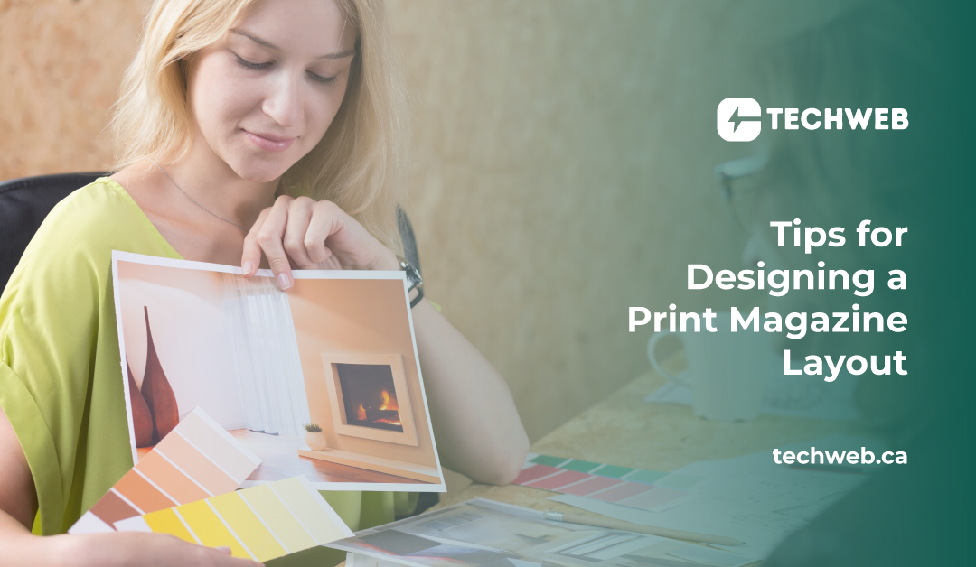
Tips for Designing a Print Magazine Layout
Designing a print magazine layout is a blend of creativity, storytelling, and technical skill. Unlike digital media, print offers a tangible experience, allowing readers to engage with content in a more intimate way. The layout of a magazine plays a crucial role in guiding the reader through the content, creating a visual narrative that enhances the reading experience.
Here are some essential tips for designing an effective and visually appealing print magazine layout.
1. Understand the Audience
Before diving into design, it’s important to understand the magazine’s target audience. Who will be reading it? What are their interests, preferences, and expectations? Knowing the audience helps in crafting a layout that resonates with them. For instance, a magazine aimed at young adults might benefit from bold, dynamic layouts, while one targeted at professionals might require a more polished and structured design.
2. Establish a Grid System
A well-organized grid system is the backbone of any good magazine layout. It provides structure, ensuring consistency across pages and making it easier to align text, images, and other design elements. A grid doesn’t have to be rigid—there’s room for creativity within it—but it serves as a guide to maintain balance and harmony in the design.
3. Prioritize Typography
Typography is a powerful tool in magazine design. It not only affects readability but also sets the tone and style of the publication. Choose fonts that align with the magazine’s theme and audience. Mix and match fonts for headlines, body text, and captions to create visual interest, but avoid overloading the design with too many typefaces. Consistent typography throughout the magazine will help create a cohesive and professional look.
4. Use White Space Wisely
White space, or negative space, is just as important as the content itself. It helps to balance the layout, giving the design room to breathe and making the content more digestible. Effective use of white space can enhance the reader’s focus on key elements, such as headlines or images, and prevent the layout from feeling cluttered or overwhelming.
5. Balance Text and Images
A print magazine is a visual medium, and the balance between text and images is crucial to maintaining reader interest. Large blocks of text can be intimidating, so break them up with images, illustrations, pull quotes, or infographics. Ensure that images complement the text rather than overwhelm it, and consider their placement carefully to guide the reader’s eye through the page.
6. Create a Visual Hierarchy
Visual hierarchy is essential in guiding the reader through the content. Use size, color, and placement to prioritize information, making it clear what should be read first and what can be skimmed. Headlines, subheadings, and body text should be clearly differentiated, and important content should stand out, drawing the reader’s attention immediately.
7. Incorporate Consistent Design Elements
Consistency is key in magazine design. Repeated design elements, such as color schemes, font choices, and graphic motifs, help to unify the magazine and give it a cohesive identity. These elements should be carefully chosen to reflect the magazine’s brand and tone, and should be applied consistently across all pages to create a harmonious look.
8. Focus on the Cover Design
The cover is the first thing readers see, and it plays a significant role in attracting their attention. A well-designed cover should be visually striking, with a clear focus on the main feature of the issue. Use bold typography, compelling imagery, and vibrant colors to create a cover that stands out on the newsstand and invites readers to pick up the magazine.
9. Pay Attention to Details
In print design, details matter. Ensure that all elements, from margins to captions to page numbers, are carefully considered and aligned. Consistent margins and spacing help create a clean and professional look, while attention to small details, like the treatment of quotes or the styling of section headers, can elevate the overall design.
10. Test and Revise
Designing a print magazine layout is an iterative process. Don’t be afraid to experiment with different layouts, fonts, and color schemes. Print test pages to see how the design looks in physical form, as some elements may not translate as expected from screen to paper. Gather feedback from colleagues or a focus group and be prepared to make adjustments to refine the final design.
Conclusion
Designing a print magazine layout is both an art and a science. It requires a deep understanding of the audience, a commitment to visual harmony, and a keen eye for detail. By following these tips, it’s possible to create a magazine layout that not only looks great but also enhances the reader’s experience, drawing them into the content and keeping them engaged from cover to cover. Remember, in the world of print, every design choice matters—make each one count.
