The Power of Visual Hierarchy in Design
Visual hierarchy is a fundamental principle in design, governing the arrangement and presentation of elements within a layout to guide the viewer’s eye and convey a message effectively. Whether you’re designing a website, poster, or any piece of visual content, understanding and applying visual hierarchy can transform your work from chaos into a harmonious, engaging, and persuasive creation.
In this blog, we’ll delve into the concept of visual hierarchy and explore its profound impact on the world of design.
What is Visual Hierarchy?
Visual hierarchy is the organization and prioritization of design elements to guide the viewer’s attention. It influences how we perceive and interact with visual information, helping us to grasp the most important aspects of a design and navigate through it.
Here are some key principles that contribute to the power of visual hierarchy in design:
1. Size and Scale
Larger elements tend to draw more attention. In visual hierarchy, you can use varying sizes to emphasize important elements or content. Headlines are often larger than body text, and the scale can be used to highlight key images or graphics.
2. Color
Color is a potent tool for drawing attention. Vibrant or contrasting colors can be used to make certain elements stand out. For example, a brightly colored call-to-action button on a webpage can guide the user to take action.
3. Typography
Font styles, weights, and sizes are essential in visual hierarchy. Bold or italicized text can emphasize key points, while varying font sizes help differentiate headings from body text.
4. Spacing and Alignment
Proximity and alignment play a crucial role in visual hierarchy. Grouping related elements together and leaving sufficient space around them can help viewers understand their relationships. Aligning elements also contributes to a sense of order and clarity.
5. Contrast
Contrast in color, shape, size, and texture creates visual interest and can draw the viewer’s attention. High-contrast elements will naturally stand out in a design.
6. Layout and Grids
An organized and well-structured layout aids visual hierarchy. Grid systems help designers create a consistent structure, making it easier for viewers to navigate content.
The Power of Visual Hierarchy
Visual hierarchy is a powerful tool that has a significant impact on how we perceive and interact with design. Here are some ways in which it is influential:
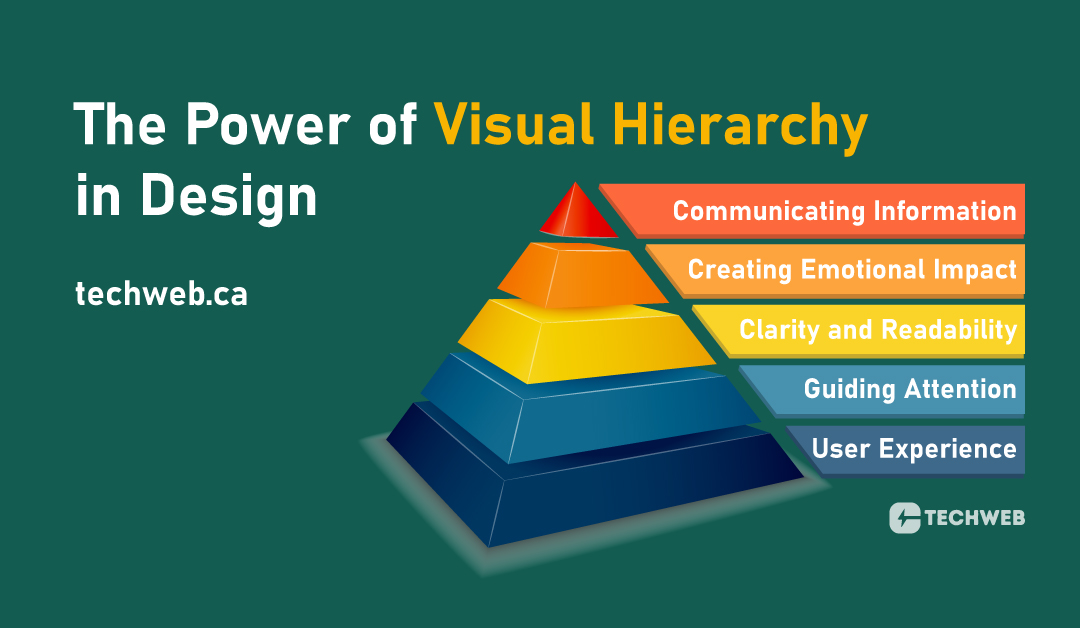
- Communicating Information: By using hierarchy, designers can effectively communicate complex information, ensuring that viewers understand the message at a glance.
- Creating Emotional Impact: Visual hierarchy can be used to evoke emotions and create a mood within a design. The placement and emphasis of elements can influence the overall tone.
- Clarity and Readability: It enhances the clarity and readability of a design by organizing content in a logical and easy-to-follow manner.
- Guiding Attention: Visual hierarchy directs the viewer’s gaze to the most critical information, ensuring that they engage with the most important aspects of a design.
- User Experience: In web and app design, visual hierarchy is instrumental in providing an exceptional user experience. It helps users find what they’re looking for and navigate the interface seamlessly.
Visual hierarchy is not only a design principle but a cornerstone in effective communication and user engagement. By skillfully employing the tools of size, color, typography, spacing, and alignment, you can guide the viewer’s attention, clarify the message, and create visually stunning and impactful designs. Whether you’re designing a website, poster, or any visual content, harness the power of visual hierarchy to captivate your audience and make your message resonate.
