
The Importance of Responsive Web Design
In today's digital age, a strong online presence is essential for businesses and individuals alike. However, it's not just about having a website; it's about having a website that adapts and performs seamlessly across various devices and screen sizes. This is where responsive web design comes into play.
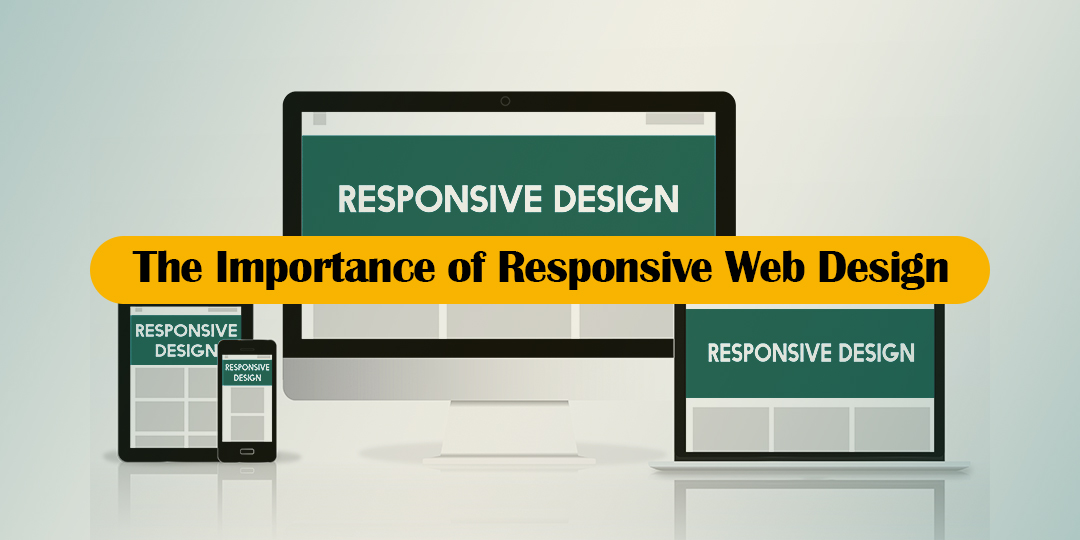
In this blog, we'll explore the importance of responsive web design and why it should be a top priority for anyone looking to establish a successful online presence.
What is Responsive Web Design?
Responsive web design is an approach to web design that aims to make web pages render well on a variety of devices and window or screen sizes. In other words, responsive websites adapt to the user's device, whether it's a desktop computer, laptop, tablet, or smartphone. This adaptability is achieved through a combination of flexible grids and layouts, responsive images, and CSS media queries.
1. Improved User Experience
One of the primary benefits of responsive web design is that it provides a consistent and optimized user experience across all devices. When visitors can easily navigate and interact with your website, they are more likely to stay, explore, and convert into customers. A positive user experience contributes to higher engagement and better conversion rates.
2. Increased Mobile Traffic
The proliferation of smartphones and tablets has significantly increased mobile internet usage. A responsive website ensures that your content is accessible and readable on smaller screens. With more users accessing websites on mobile devices, having a responsive design is essential to reach and connect with a broader audience.
3. Better SEO Performance
Search engines like Google prioritize mobile-friendly websites in their search results. A responsive web design is a crucial factor in achieving better search engine rankings. Google's mobile-first indexing means that the mobile version of your site is used for indexing and ranking. If your website isn't mobile-friendly, it may suffer in search engine rankings, affecting your online visibility and traffic.
4. Cost-Efficiency
Maintaining a separate mobile version of your website can be costly and time-consuming. Responsive design eliminates the need for a separate mobile site, as it automatically adjusts to different screen sizes. This streamlines development and maintenance efforts, reducing costs in the long run.
5. Future-Proofing
The digital landscape is continually evolving, with new devices and screen sizes regularly emerging. Responsive web design is future-proof, as it ensures that your website remains accessible and functional on upcoming devices without the need for a complete redesign.
6. Competitive Advantage
A responsive website is a competitive advantage in today's market. It demonstrates your commitment to providing an excellent online experience for all users, regardless of their chosen device. In contrast, a non-responsive site may deter potential customers and drive them to competitors with more user-friendly websites.
Responsive web design is not merely a trend; it's a necessity in the digital age. It directly impacts user experience, mobile traffic, search engine rankings, and your overall online success. Whether you're running a business, a personal blog, or an e-commerce site, prioritizing responsive web design is a strategic decision that ensures your online presence is accessible, adaptable, and poised for success in a rapidly evolving digital landscape. Embrace responsive web design and provide your users with the seamless experience they deserve.