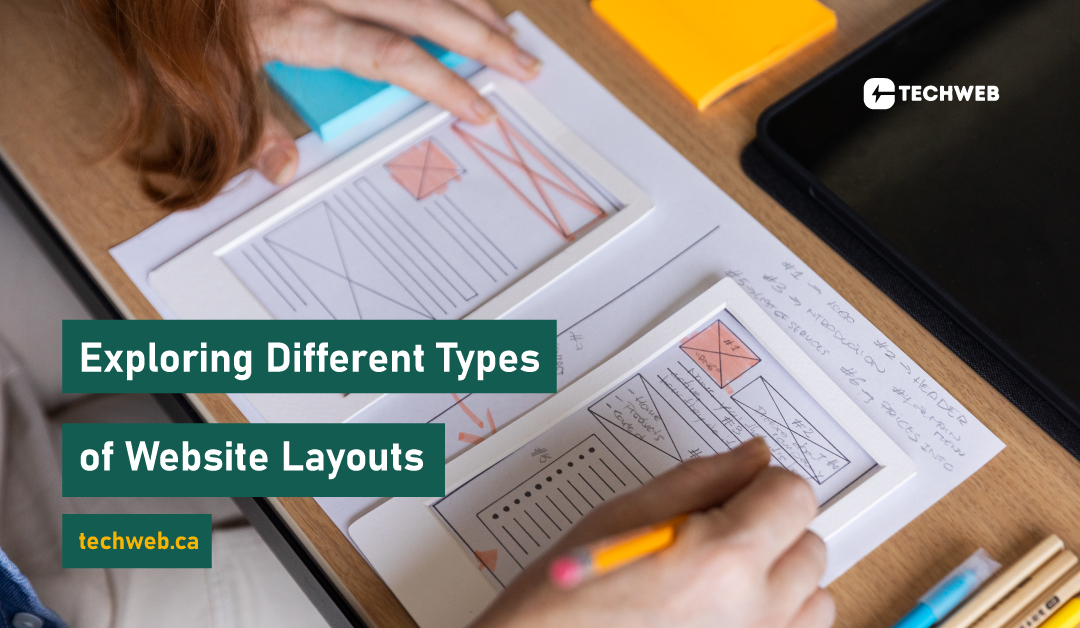
In this blog, we’ll explore different types of website layouts, discussing their characteristics, use cases, and the impact they have on user engagement.
1. Fixed Layouts
Fixed layouts have a set width, and the content remains centered on the screen regardless of the device or screen size. This type of layout provides a consistent viewing experience, but it may not be as responsive for users on different devices.
Use Case: Suitable for websites with content that doesn’t need to adjust to various screen sizes, such as portfolios or personal blogs.
2. Fluid or Liquid Layouts
Fluid layouts, unlike fixed layouts, use percentages for widths. The content expands or contracts based on the screen size, making it more responsive to different devices. However, this approach can lead to variable content spacing.
Use Case: Ideal for websites where flexibility across different screen sizes is essential, enhancing the user experience on various devices.
3. Responsive Layouts
Responsive design combines flexible grids and layouts with media queries to adapt to different screen sizes. It ensures an optimal viewing experience by adjusting the content and design elements based on the user’s device.
Use Case: Essential for modern websites that aim to provide a seamless experience across desktops, tablets, and smartphones.
4. Grid Layouts
Grid layouts organize content into columns and rows, creating a visually balanced and structured design. This type of layout is widely used for its simplicity and readability, making it easier for users to navigate.
Use Case: Suited for a variety of websites, including blogs, news platforms, and e-commerce sites, where clear content organization is essential.
5. Masonry Layouts
Masonry layouts, inspired by the arrangement of bricks in masonry construction, feature irregularly shaped containers that fit together like a puzzle. This layout creates a dynamic and visually interesting design with varying content sizes.
Use Case: Effective for portfolios, galleries, and websites showcasing visual content, allowing for a unique and engaging presentation.
6. Single-Page Layouts
Single-page layouts consolidate all content into a single, vertically-scrolling page. Navigation is often achieved through internal links that smoothly scroll to different sections. This layout is popular for its simplicity and streamlined user experience.
Use Case: Well-suited for personal portfolios, small business websites, or product landing pages where concise information presentation is key.
7. Parallax Scrolling Layouts
Parallax scrolling involves background images moving at a different speed than the foreground, creating a sense of depth and immersion. This adds a dynamic and interactive element to the user experience.
Use Case: Great for storytelling and visually engaging websites, such as product launches or brand narratives.
8. Asymmetrical Layouts
Asymmetrical layouts break away from traditional symmetry, embracing an intentional imbalance. This design approach adds a sense of creativity and uniqueness to the website.
Use Case: Ideal for brands or websites aiming for a modern and avant-garde appearance, conveying a sense of innovation and individuality.
9. Card-based Layouts
Card-based layouts organize content into individual cards, each containing a specific piece of information. This design trend, popularized by platforms like Pinterest, offers a modular and easily digestible format.
Use Case: Effective for content-heavy websites, social media platforms, and e-commerce sites, providing a visually appealing and organized presentation.
Conclusion
Selecting the right website layout is a crucial decision that influences how users interact with your content. Whether you prioritize simplicity, responsiveness, or creativity, the type of layout you choose should align with your brand identity and user experience goals. By exploring the diverse options available, you can find the perfect layout that enhances your website’s functionality, aesthetics, and overall impact on your audience.
