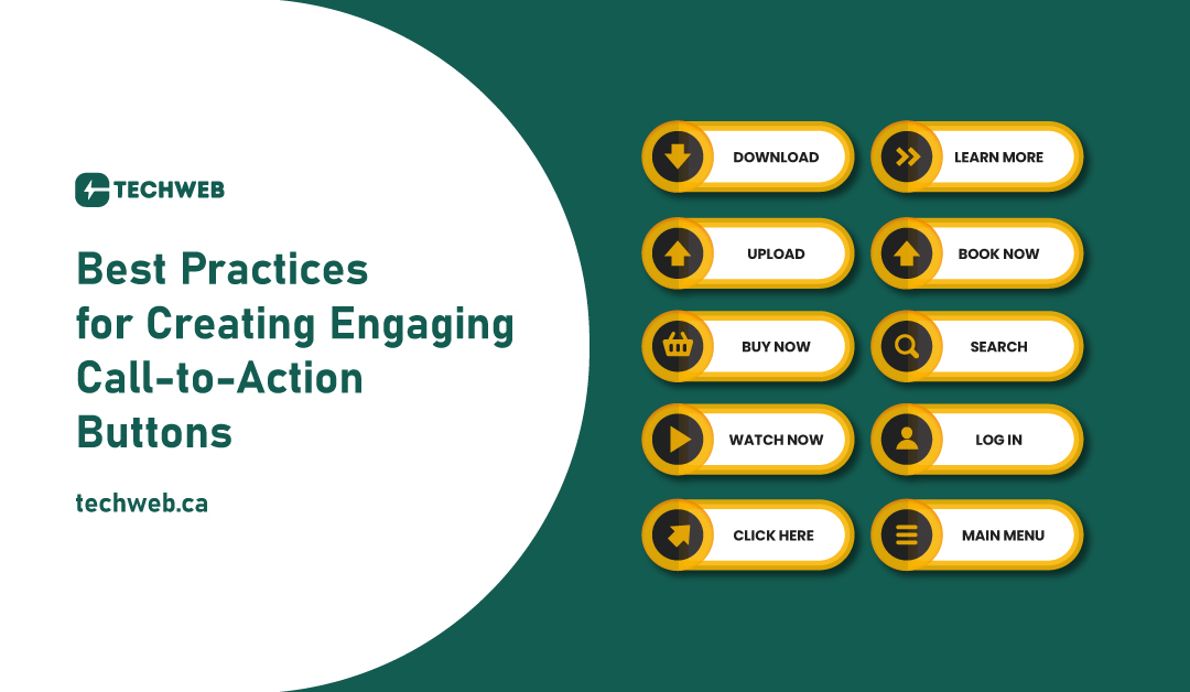
In this blog, we’ll explore the best practices for creating engaging call-to-action buttons that not only capture attention but also drive conversions.
1. Clarity and Conciseness
Your CTA text should be clear, concise, and action-oriented. Users should instantly understand the purpose of the button and what will happen when they click it. Use compelling verbs that convey the intended action, such as “Buy Now,” “Subscribe,” or “Download.”
2. Standout Design
Make your CTA button visually distinct from the rest of the page elements. Use contrasting colors that align with your brand but stand out against the background. The button should catch the user’s eye without being overwhelming or clashing with the overall design.
3. Size and Placement
Ensure your CTA button is appropriately sized and strategically placed on the page. It should be large enough to be easily clickable but not so big that it dominates the entire layout. Place the button where users are likely to see it without having to scroll extensively.
4. Responsive Design
In the era of mobile browsing, your CTA button must be optimized for various screen sizes. Test its appearance and functionality on different devices to ensure a seamless experience. Responsive design contributes to a positive user experience and encourages engagement across platforms.
5. Compelling Copy
Craft compelling and persuasive copy that entices users to take action. Use language that instills a sense of urgency or communicates the value proposition. Experiment with different wording to see what resonates best with your audience.
6. Consistent Branding
Maintain consistency in design elements, including color, typography, and overall style. Your CTA button should seamlessly blend with the overall brand aesthetic, reinforcing a cohesive and professional look.
7. Hover and Click States
Implement hover and click states to provide visual feedback when users interact with the button. This not only enhances the user experience but also communicates that the button is interactive. Consider subtle animations or color changes to signify interactivity.
8. Strategic Placement
Consider the flow of user engagement on your webpage and strategically place CTAs where they make the most sense. Whether it’s at the end of a blog post, within product descriptions, or as a popup, strategic placement can significantly impact conversion rates.
9. A/B Testing
Perform A/B testing to assess the effectiveness of different CTA variations. Test different colors, copy, and placements to determine which combination yields the highest conversion rates. Regular testing allows for continuous optimization.
10. Clear Value Proposition
Clearly communicate the value users will receive by clicking the CTA button. Whether it’s access to exclusive content, a special offer, or a time-limited discount, the perceived value encourages users to take action.
11. Accessibility
Ensure your CTA buttons are accessible to users with disabilities. Use sufficient color contrast, provide descriptive alt text for images, and make sure the button is navigable using keyboard commands. Accessibility not only broadens your audience but also aligns with ethical design practices.
Conclusion
Creating engaging call-to-action buttons requires a strategic blend of design, psychology, and user experience considerations. By following these best practices, you can optimize your CTA buttons to not only attract attention but also drive meaningful user interactions. Remember that continuous testing and adaptation are key to refining your approach and ensuring that your CTA buttons remain effective in an ever-changing digital landscape.

